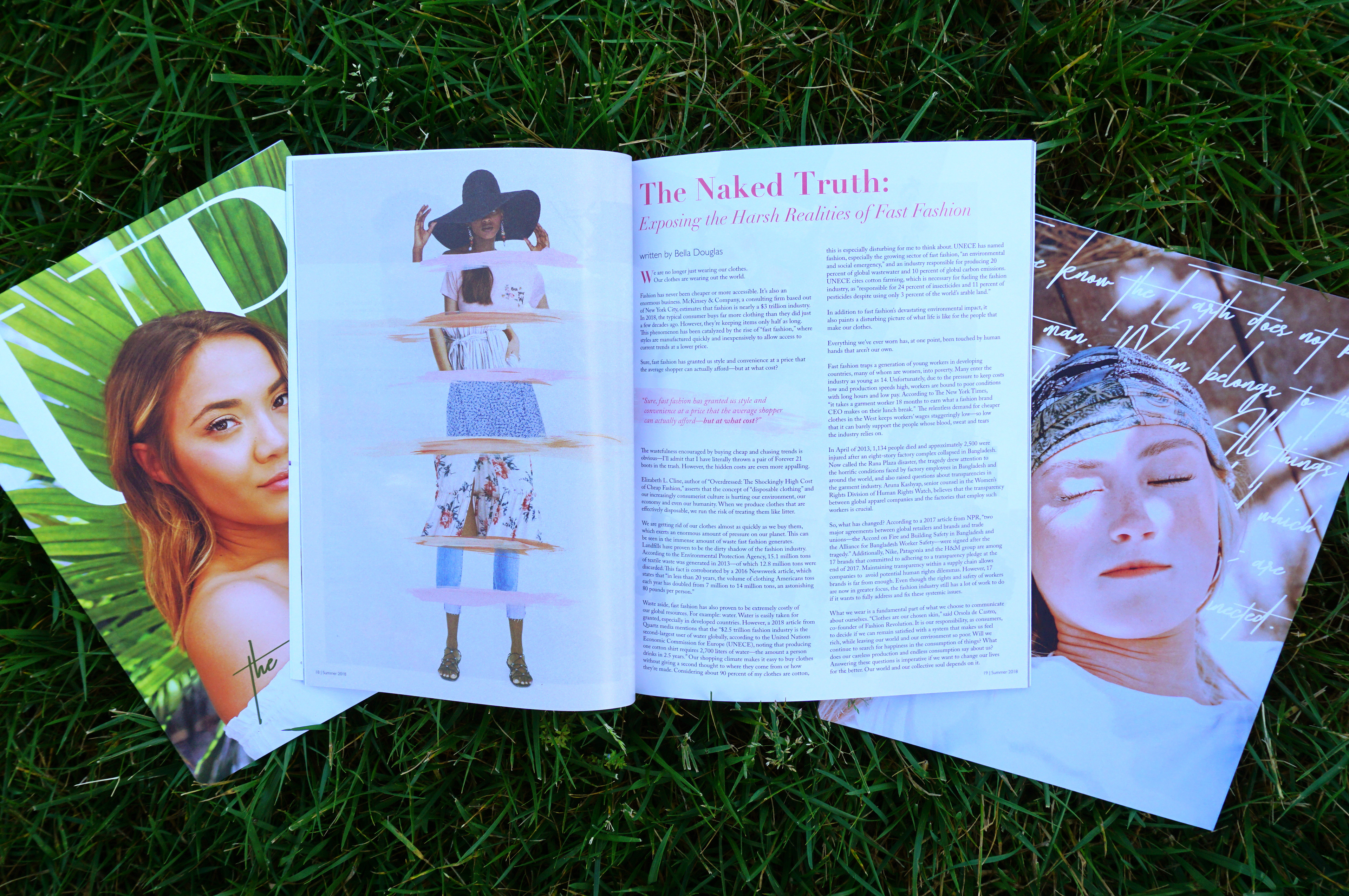
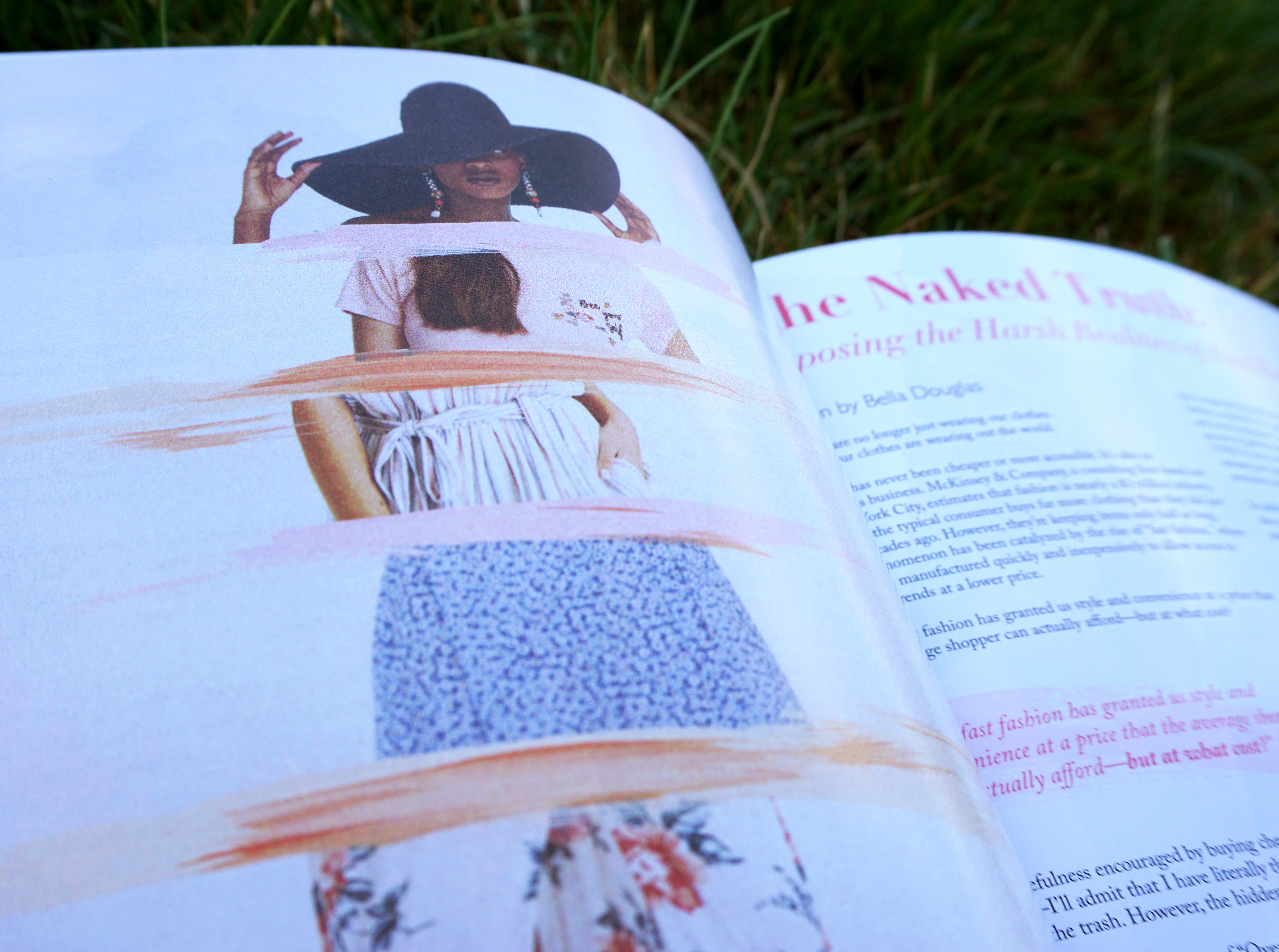
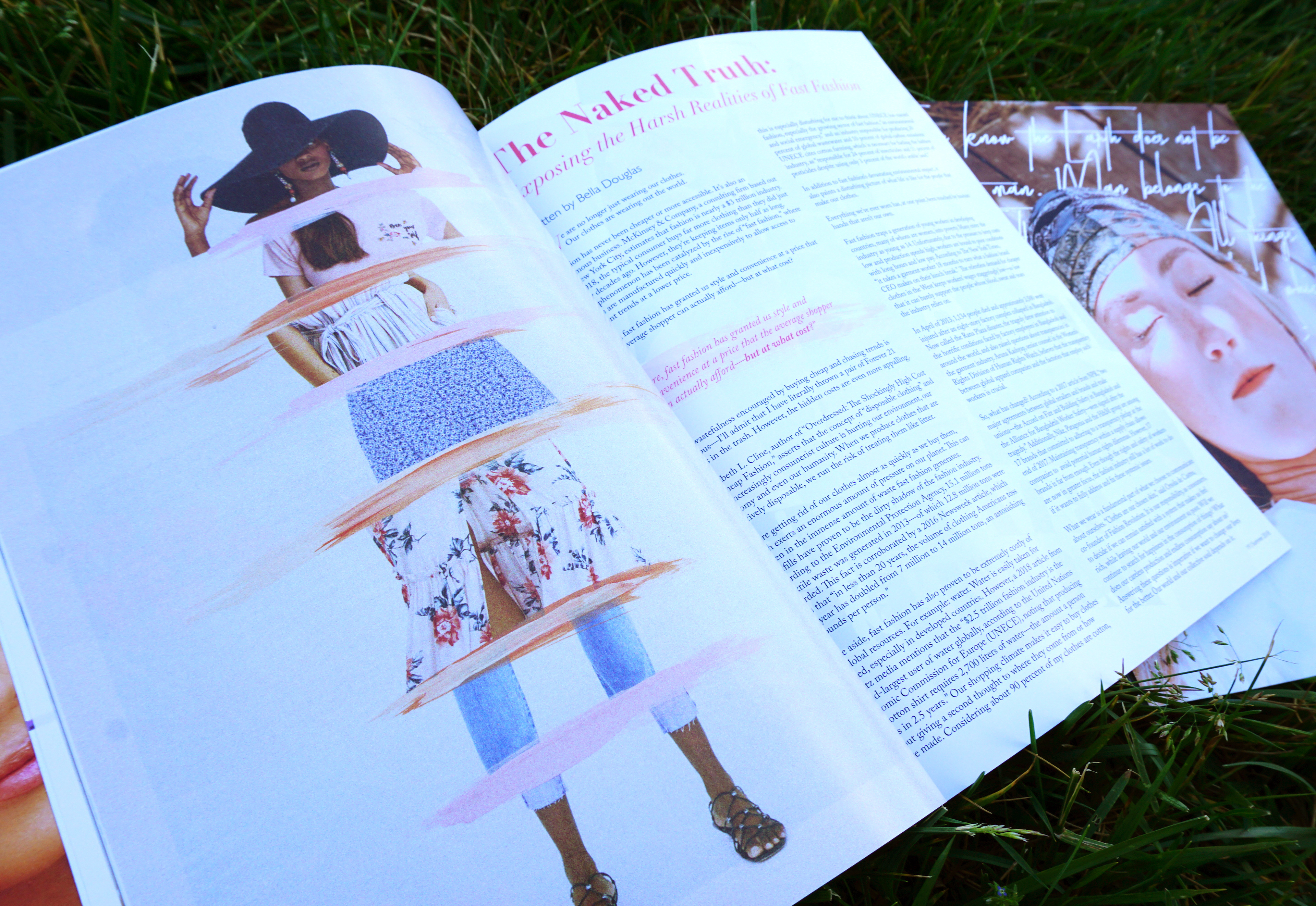
UP Magazine is a student-led fashion and lifestyle publication. For the spring issue, the executive team decided on the theme of "Re-" as in reduce, reuse, recycle. This issue focused on sustainability and the environment. The magazine was printed on recycled paper, and it was printed on larger paper than our other issues because we felt this issue was important and had a big message. I was given an article about the consequences of fast fashion. With new technology and social media, everyone wants the latest trends NOW and for a good price. Fast fashion is defined as inexpensive clothing produced rapidly by mass-market retailers in response to the latest trends. While fast fashion can make a consumer feel trendy for a moment, the lasting consequences on our environment are devastating and this cycle cannot continue as it is. I was not given photography to use for this article, so I had to make my own image to go along with the text. I decided to pull images from fast fashion websites such as Zara, H&M, and Shein to create a collage of a model sporting many different fast fashion trends. Separately, these trends could look nice, but together they clash and look messy. This represents people's disillusion that as individuals we think supporting fast fashion brands isn't a big deal, but as a community it is causing disastrous effects to our environment.
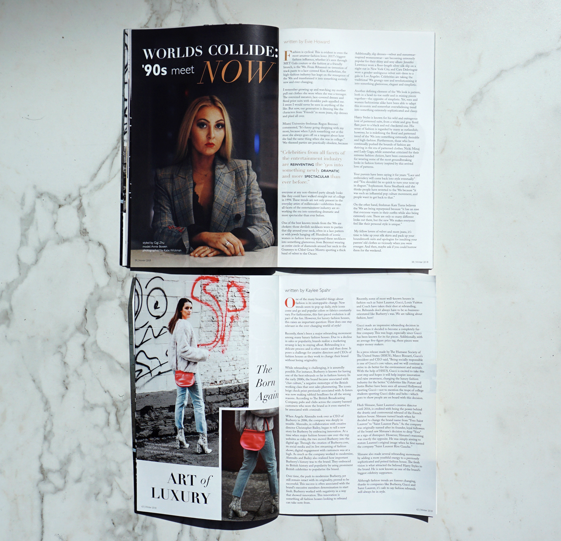
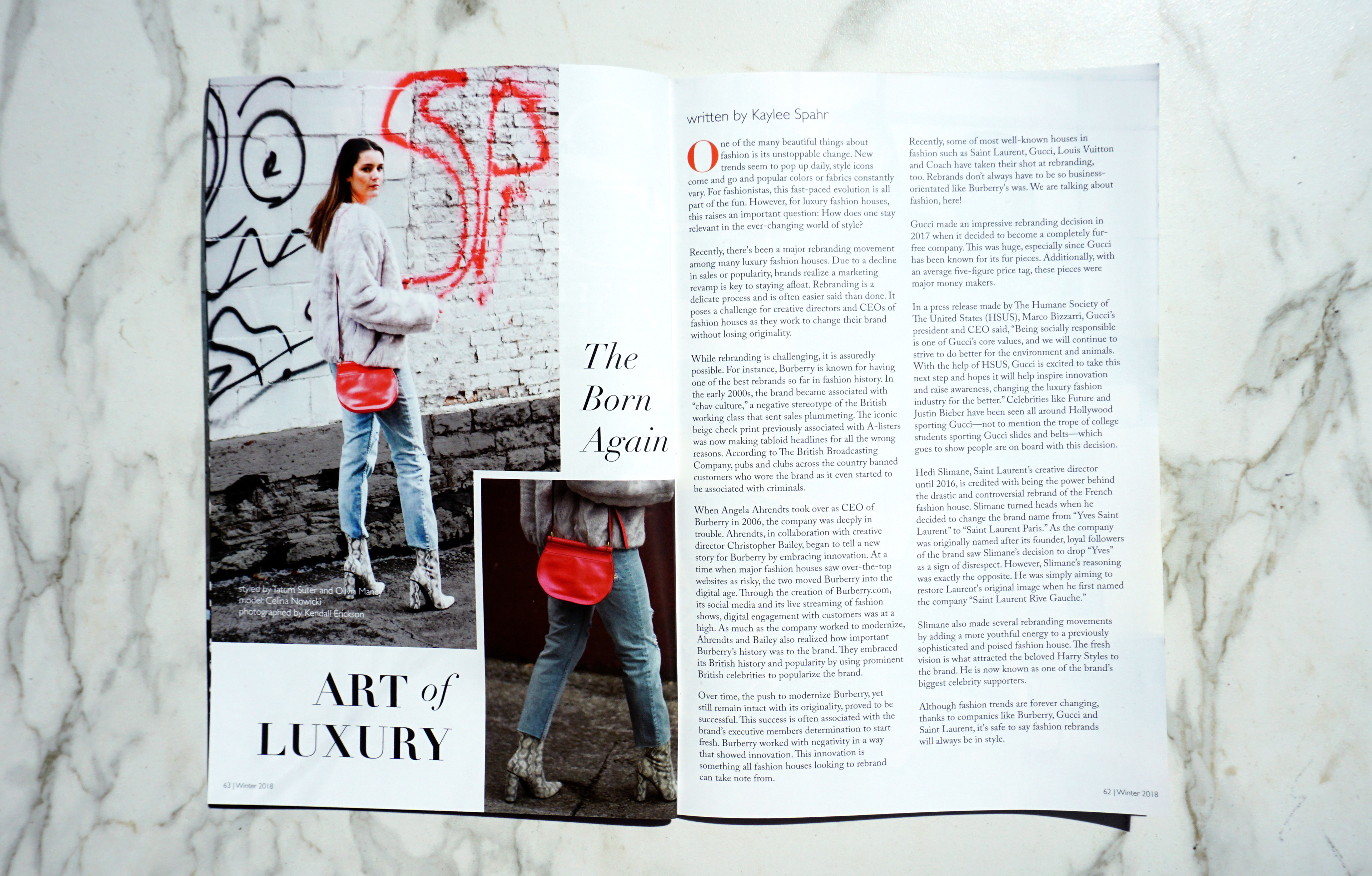
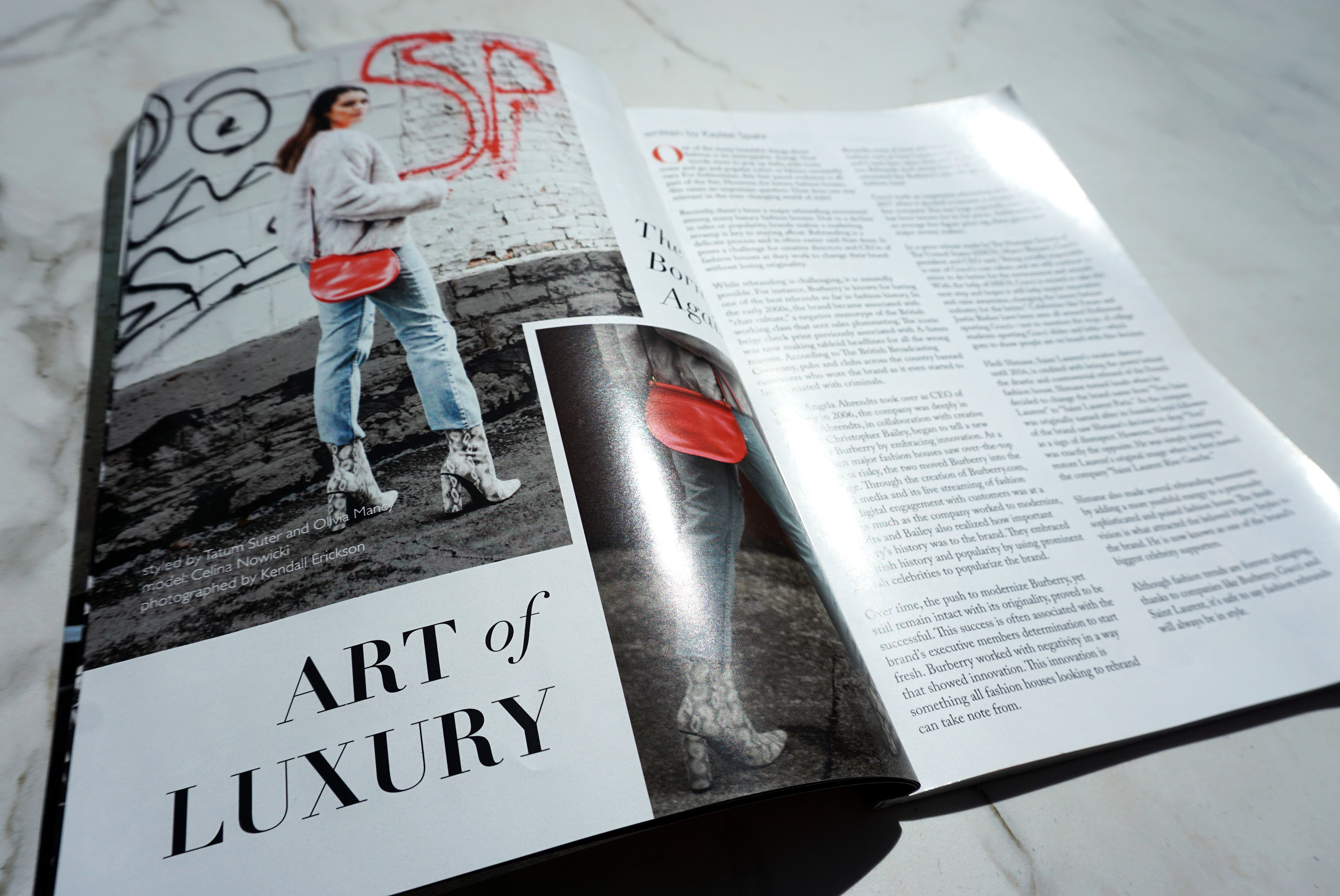
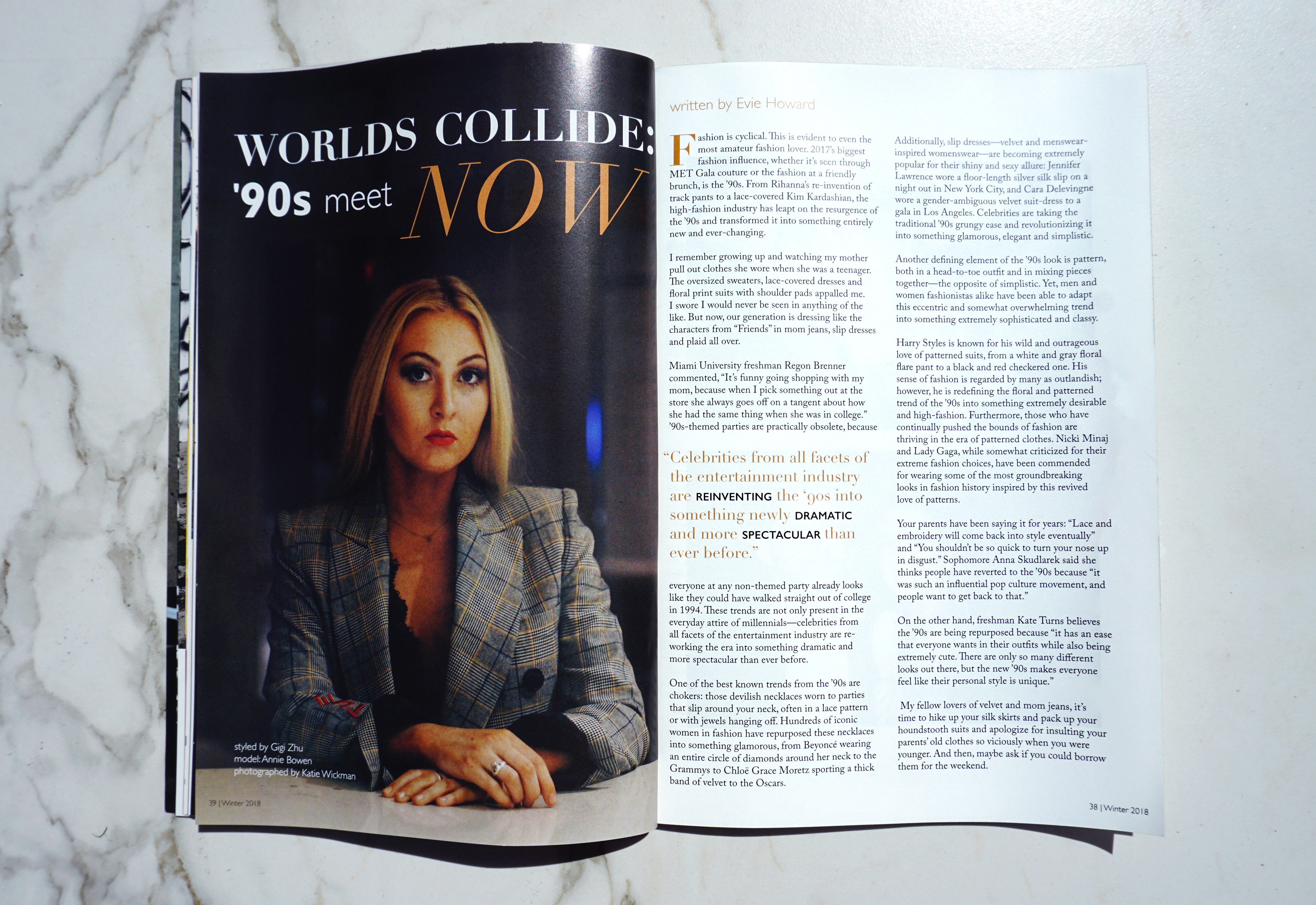
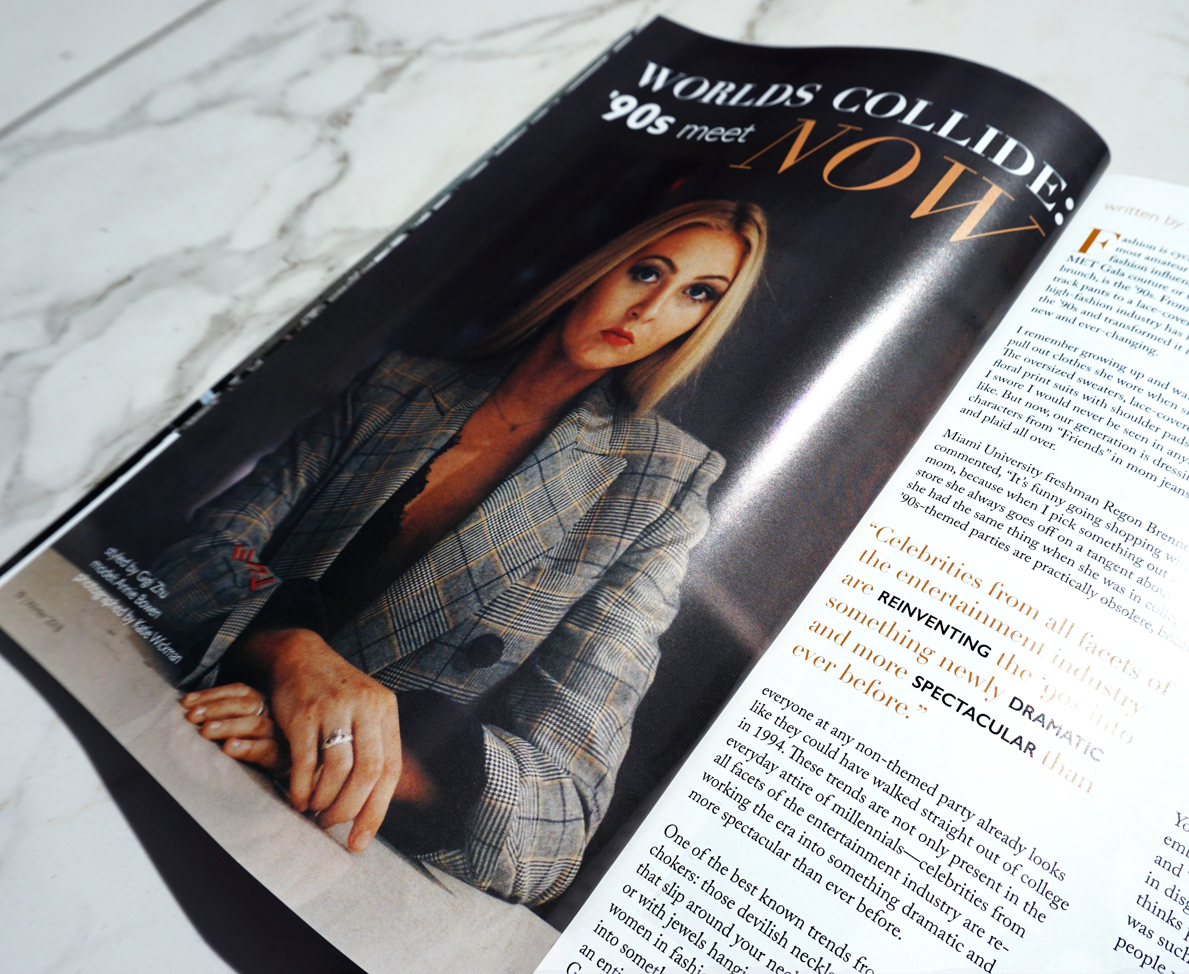
For the winter issue, our theme was Purpose and I began my process by finding purposeful design inspiration. My vision included lush, deep hues and clean, well-crafted imagery. I was assigned two spreads for this issue about luxury fashion and 90’s trends making a comeback. With the theme in mind, I decided to focus on classic editorial design with rich photography.
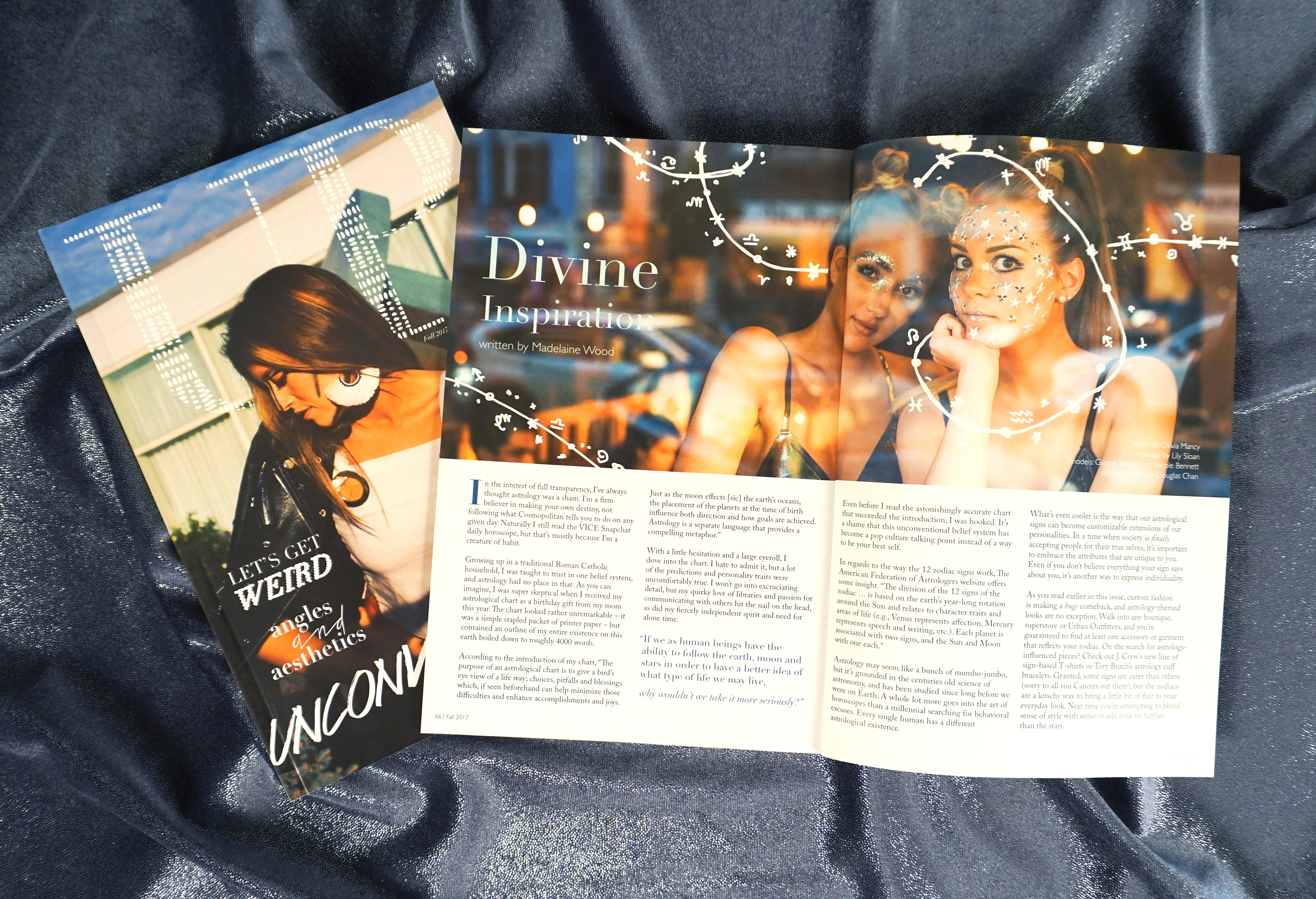
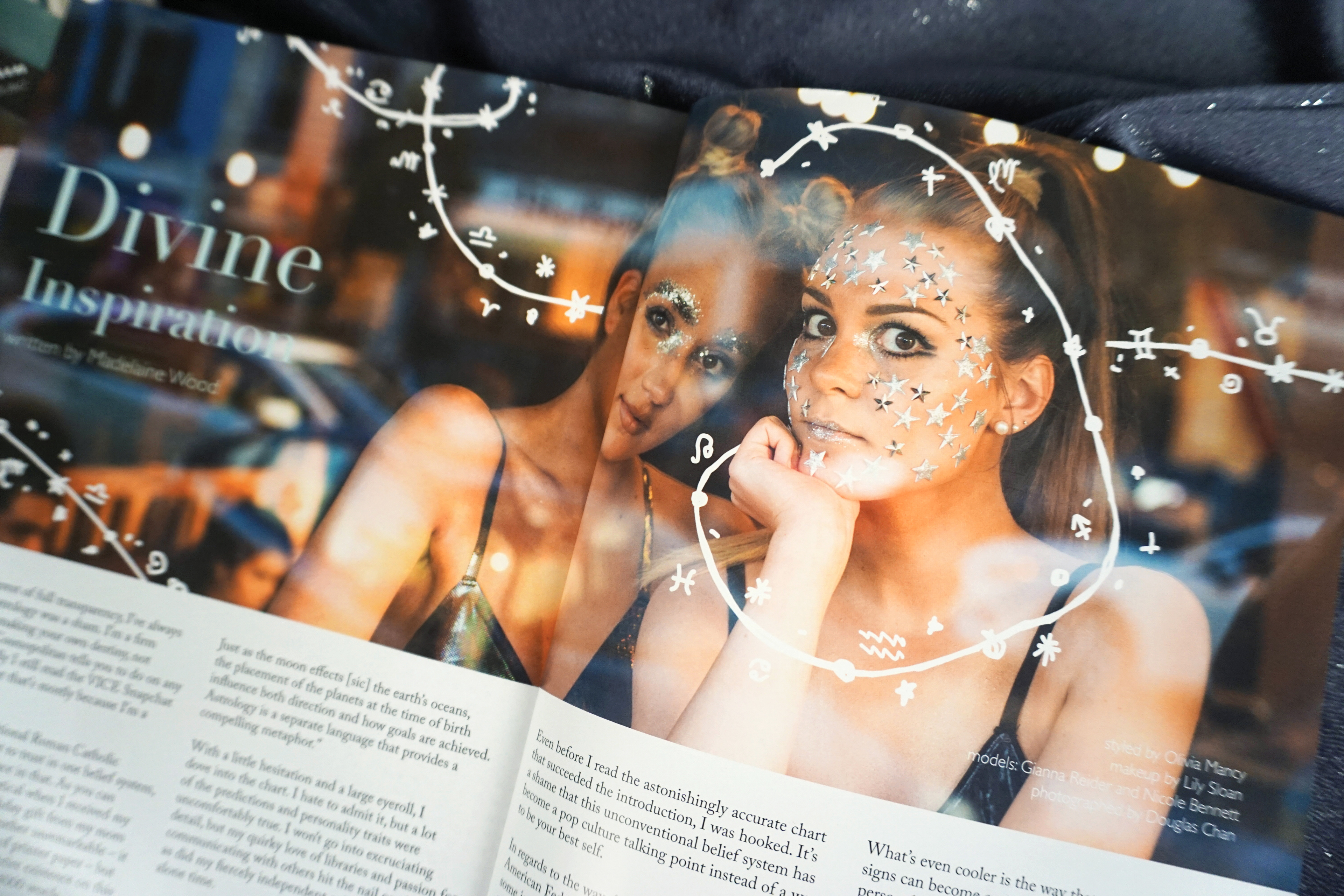
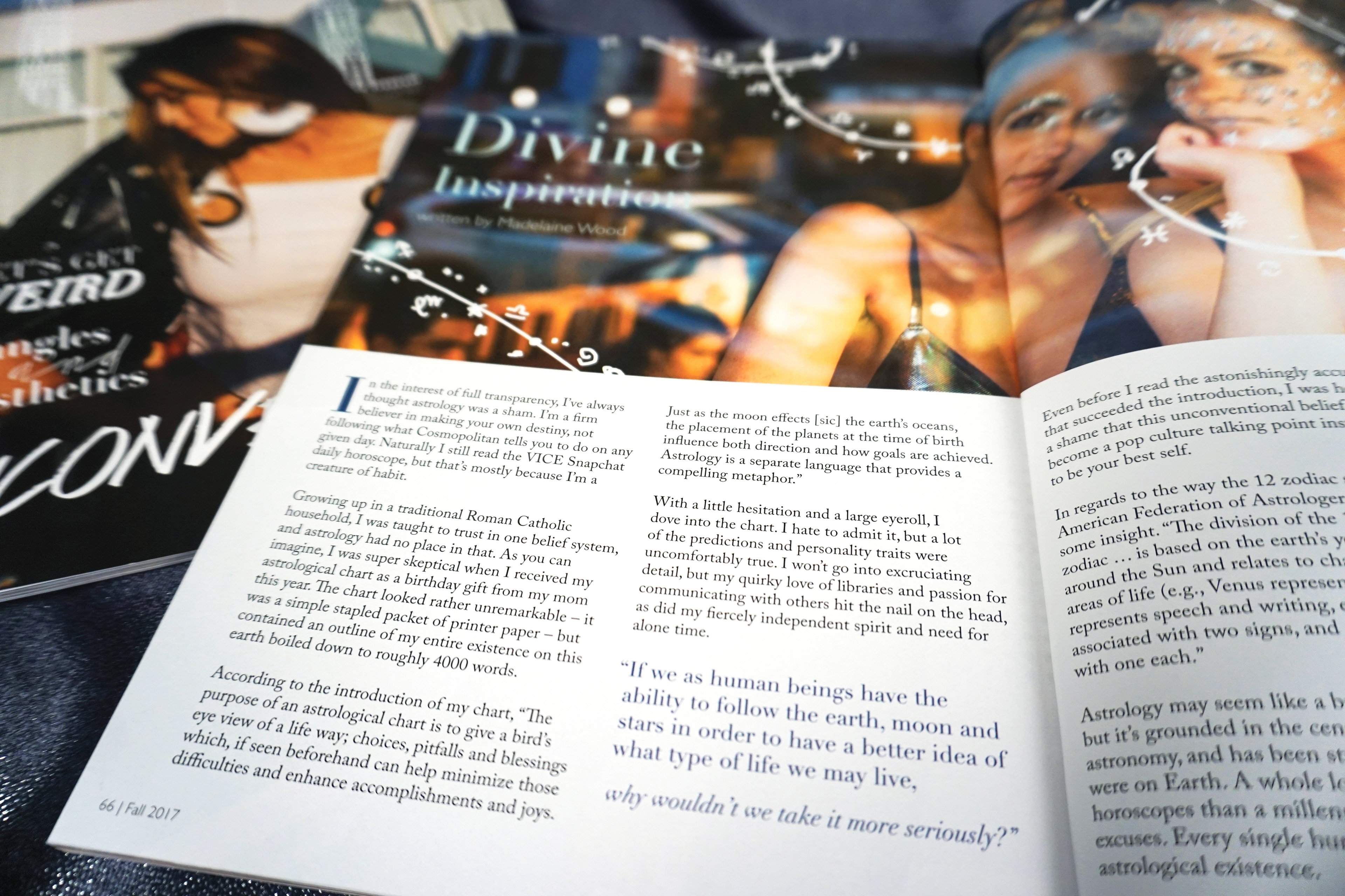
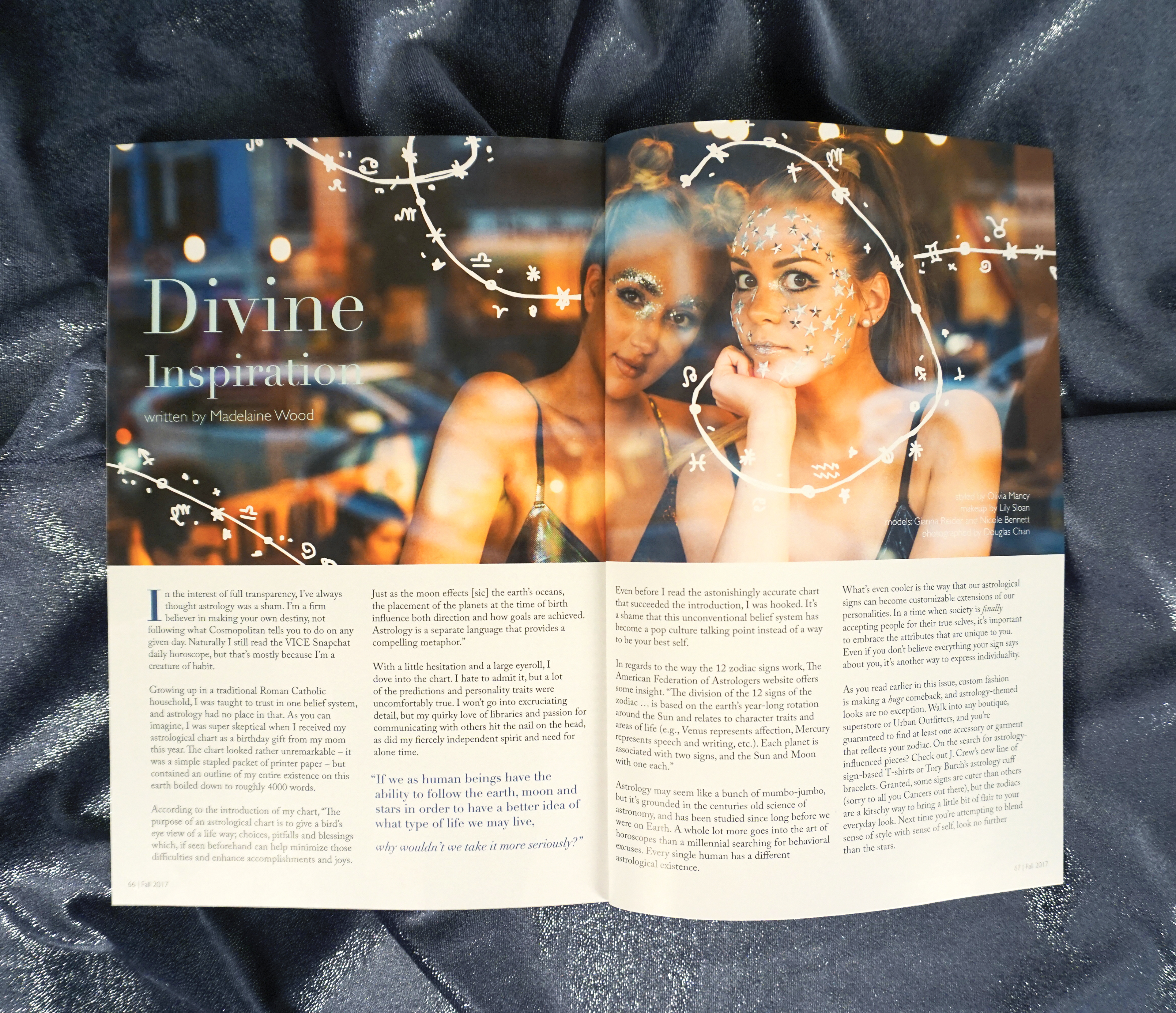
UP's fall theme was Unconventional, so I decided to push the envelope a bit with my spread and played around with incorporating hand-drawn elements into the photography. My article was about astrology, so I drew the symbols for the zodiac signs along with stars, moons, and planets.